Shell's "Diagram of the month"

Hi gang,

About this thread

Visual Paradigm supports a lot of different diagram types. This ranges from diagrams which are build upon official standards (think about the Use Case (UML), Business Process (BPMN) and even the Requirements diagram (SysML)) but also diagrams which were basically designed by Visual Paradigm themselves. For example the Textual Analysis (this is a really powerful tool to start a project by the way), The Brainstorm diagram (“sticky notes” in Visual Paradigm :wink: ), and there are several Grid based diagrams where Visual Paradigm basically used a commonly available grid in a new and interesting way.

Or what to think about existing diagram styles which Visual Paradigm severely enhanced? The Customer Journey Map comes to mind here.

Now… I think that the Visual Paradigm website does a really good job in displaying all the provided features. But it doesn’t always get into the detail of the individual diagrams. So I figured, why not showcase some diagrams individually and explore how they might enhance your workflow?

I feel the need for a small disclaimer, but if you had enough dry theory already you can safely skip to the first main header (you won’t miss anything important for following this thread).

Small disclaimer

I fully realize that the use of diagrams within the field of data analysis is driven by necessity and usually has little to do with personal preference. My purpose for this thread is simply to act as some kind of showcase to demonstrate some of the things Visual Paradigm can do. And not necessarily in the hands of a professional: the other reason I’m starting this thread is because it’s also a fun way for me to study some of these diagrams and learn more about them before sharing my findings.

And although I will definitely do my best I cannot rule out that some mistakes might happen (but if those do happen I will obviously admit to the mistake and correct it).

Also: some people sometimes wonder about me so let’s get some things out of the way: No, I do not work for Visual Paradigm. Yes, I am definitely a fan: I really enjoy working with Visual Paradigm in both a semi-professional way (= using UML / BPMN for my personal projects) as well as hobby based. I actually have downloaded several of the formal modeling specifications from the OMG group which I’m also studying (just for context). No, I don’t think Visual Paradigm is perfect. In fact, I even discovered quite a few flaws myself over the past the years. But I do think Visual Paradigm is one of the best modeling suites available and I seriously admire the dedication by the Visual Paradigm team towards their product.

And when I like something I tend to vent a little :wink:

But just so we’re clear: I share the same amount of enthusiasm for FreeBSD, NetBeans and the game of Minecraft. If you look up my nickname in combination with those then you’ll find me. Me “backing up” Visual Paradigm is only driven by one simple motivation: I seriously like the software as well as admire the company behind it. And when I like something, you get posts like these :sunglasses:

Sorry for the long intro but several people asked about some of my reactions / responses towards Visual Paradigm so I figured I’d share.

Business rules diagram

I know, I know: the official name is Business Rule Grid. But I’m still tempted to call this a diagram because we also have the Matrix diagram (grid based) and Chart diagram (also grid based). On top of that: this will really come to live if you don’t start with setting up the grid, but instead focus on the rule elements themselves.

Adding a broader view

What makes this diagram stand out for me is its accessibility. But first off: what is a business rule exactly? Well, according to Wikipedia:

Take note: operations, definitions and constraints.

So how would we apply this? Very simple: just add the rule to the diagram(s) they apply to. For this very purpose I gave the rules a specific format so that they would stand out.

Examples of usage

Let’s take this Use case into consideration:

image

And also the follow up on “cool stuff” (quite the description, eh?):

So here we are, 2 diagrams describing different aspects of our system and both contain a business rule. So the interesting part here is that you can apply those rules in any way you want. Your different diagrams describe different parts of the system and by adding those rules you’re basically applying a layer “on top” of what you already have:

So here I added a new business grid, and also added some custom columns to determine some aspects which are important to this situation. Within the individual diagrams all you have is an extra element. One which could easily be disregarded if need be (using layers for example).

But if you then open up the business grid you get a solid overview which showcases new directions and new possible bottlenecks to address. I mean… all I did was adding some concerns. For example: when looking at the above diagram (I know it’s kind of crude) I’d immediately raise a question: how does the admin get a copy of the log?

It has no direct impact on the rest of the diagrams (it could have of course) but clearly showcases a possible concern which may need to be addressed.

And all thanks to a ‘simple’ grid diagram which basically only contains specific model elements listed across different diagrams.

Which also somewhat explains why I like this so much. The Business rule grid is a feature only available in the Professional feature (and up) and although you most likely won’t miss this if you use a lower tier license its value really becomes obvious once you started to use it.

Sure: this is a simple looking aspect. But things which look easy…

Availability

The Business rule grid is available in VP Professional and up.

Official description

See this VP webpage: “A business rule is a statement that describes a business policy or procedure. Business rule grid is an ideal tool for accommodating a large amount of business rules in a manageable manner.”.

Difficulty

2 out of 5. But it depends on how you approach this. If you start by creating a grid and then adding rules (also possible) then it might become more difficult. But if you apply these rules as individual model elements to your existing diagrams (or diagrams you’re working on) then the “business rule puzzle” can easily fall into place fully automatically.

Personal impression

It is not something I use very often myself, but when I do I can’t help but be a little amazed at the impact of something as simple as a mere grid diagram. I think that Business Rules are well in place within the Professional tier, even though I wouldn’t be easily able to afford them as an individual user myself.

But if you do decide to invest then I think you won’t be disappointed because of the ease of use and the easily gained results.

Diagram of the month for March: Business rule grid.

And there you have it!

Thanks for reading and hopefully until the next post in this thread! (approx. 4 weeks from now, give or take; one entry per month). I hope you enjoyed.

4 Likes

Editorial: It’s been a little longer than I anticipated, but I haven’t forgotten about this thread. I had to deal with a two-faced problem: first I set a little too high standard for myself (a very complex yet also very impressive diagram, I will address this in a later post) and my available time also got severely limited due to work obligations.

June 2018

The Data Flow Diagram (DFD)

The data flow diagram (“DFD”) is one of those hidden pearls within Visual Paradigm and it is easy to overlook. You can think of a DFD as a combination of a Use Case and a Communication diagram, both of which you can find within the UML specification.

There is no official standard for a DFD (just try looking it up on Google Images) and that’s also where its advantage lies. Sounds weird? It’s simple really: this allows you to set up a rough overview of your project and the involved data without having to worry about invalidating your diagram.

And that allows you to fully focus on the data and less on ensuring that you correctly comply to the current standards. To emphasize on this I added a small square and a shout-out box which provides us with some extra information.

Overview of used model elements

The diagram structure is really very simple, the whole diagram actually consists of only three main model elements:

  • External Entities: These are entities which somehow interact with your system.
  • Process: The specific task(s) which are supported by the system.
  • Data Store: This represents the manifestation of certain data.

Specific enhancements

Visual Paradigm wouldn’t be Visual Paradigm if it didn’t provide us with some specific features unique to working with VP :wink: As you can see I can number my processes, I can create relations between them, but what if I want to further describe the detailed inner working of a process?

We could always consider to add a sub diagram but VP has something even better set up for us:

Decomposition!

Although this is basically the same thing as creating a new sub diagram it also provides a specific advantage: all the model elements which are related to your current process can be automatically added to the new diagram, which will make it a lot easier for you to work out your subprocess!

And as mentioned before: you don’t have to worry too much about specifications.

Availability

The Data Flow Diagram is available in Visual Paradigm Modeler and up.

Difficulty

On my personal difficulty rating (which goes from 1 to 5) I give this a 2 out of 5. The limited amount of required model elements combined with the resource catalog makes this a really easy diagram to get started with.

The reason I still set it to 2 is because despite its simplicity the DFD actually has some hidden settings which could slightly add to its complexity. For example, those Data Store model elements? They actually have 4 types for you to use:

  • Computerized data (as shown in my example).
  • Manual
  • Transient data file
  • Transient manual

Although this doesn’t make it too complex it’s still something to keep in mind.

And there you have it!

The next time you’re struggling a little bit with structuring your project, especially if that involves compliancy with current standards, then maybe this diagram can help you focus by setting up a rough overview.

3 Likes

July 2018

The Entity Relationship Diagram (ERD)

image

Some people think that designing a database is pretty easy. After all: you simply make the database itself, add several tables and containing fields and you’re done. Well… maybe not so much. There’s a huge difference between “a database” and an optimized database.

If done right then you want to store your data in the most optimal way possible. Not only does this save storage space, it will also ensure that your database can quicker access the data it needs.

Take for example the diagram above. Many people would be tempted to set up a database like that with one table containing name, address, and city. Not necessarily wrong, but there is a problem with that design. Because although each user may be unique, the same can’t be said for the cities they live in. It’s easily possible that many users live in the same city.

The result of this would be that you’d store the name of the city multiple times within the users table. And that’s not very efficient.

Fortunately there are tools to help us with these designs, and ERD is one of them.

VP’s three phases of database design

What really sets the ERD in Visual Paradigm apart are the three different data models which you can use:

image

What this means is that you can make the diagram design as complex or as abstract as you want. If you take another look at my first example then you’ll probably notice that it is actually a bit of a weird database.

After all: how would the relationship between ‘Users’ and ‘Link’ work when there are no matching fields?

Well, it wouldn’t. But in this stage of my design that’s not important at all. What does matter is that I showcased the underlying theory behind my database design. In fact; although I did add some fields to the tables I could have easily skipped that part as well. All which matters is to get a good overview of the general concept of my upcoming database.

The conceptual view, as shown above, is the most abstract one. It shows tables, some optional fields (yet without any details) and it’s meant to focus on the tables and their underlying relationship(s).

When you’re satisfied with the first stage then you can transition your diagram to the next level of complexity; either a logical or physical model.

image

The logical model, as shown here, adds more detail to your design. It now shows primary keys, it can (automatically) set up foreign keys which will help to establish relationships between tables and it also shows much more details about the fields as well.

Although it is still somewhat abstract (by hiding specific aspects of your design such as automatically generated keys) this model sits a lot closer to the actual database design which will be eventually used.

That design will only be displayed in the final model which is the physical design, as shown below.

image

Now we’ve reached the phase where our design should match the setup of the actual database. In other words: what you see here should eventually fully match the situation as it would be used within a database server.

Even better: it actually does, thus allowing you to export your design(s) and apply them onto a real database server. You can even use Visual Paradigm to start inserting actual data.

Availabaility

The Entity Relationship Diagram is available in all Visual Paradigm editions.

Difficulty

On my personal difficulty rating this scores a 3 out of 5. Although setting up the diagram itself doesn’t have to be all that difficult the involved theory on database design can be tricky to apply correctly. Designing a good database can honestly be a professional in itself.

And there you have it!

I think that the ERD provides a good example why Visual Paradigm is much more than just a modeling or general design tool.

3 Likes

August 2018

Summer deal: two diagrams for the price of one! :wink:

Business Process Modeling and Notation (BPMN)

The BPMN standard is a personal favorite of mine and something which I would describe as “the swiss army knife amongst modeling standards”. It is based after the traditional flowcharts (it also shares some traits with the Activity diagram from the UML standard) and it is heavily optimized to conform as best as possible to current business processes.

But don’t let that description fool you… Just because it was meant for business processes doesn’t mean you’re limited to only showcasing things which would happen within a business or industry. Far from it.

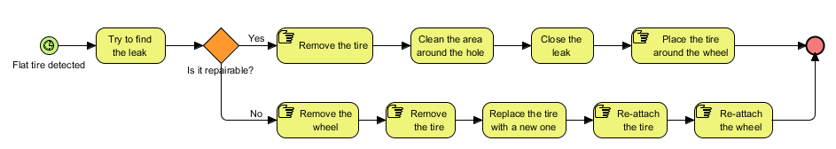
Here I set up a diagram showcasing tire repair. The process starts at the left with the time event: when you detect a flat tire then it’s time to set this process into motion. You then follow the steps to the right, with a question in between. This also shows the strength which I think the standard has: it provides all the tools you’d need to describe a process as in-depth or as abstract as you may need.

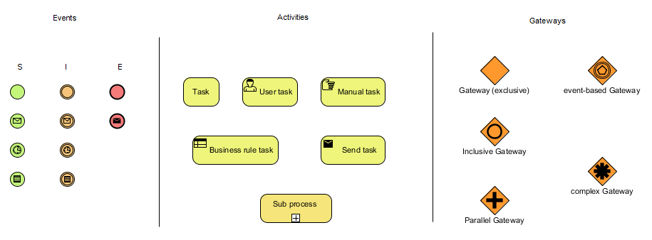
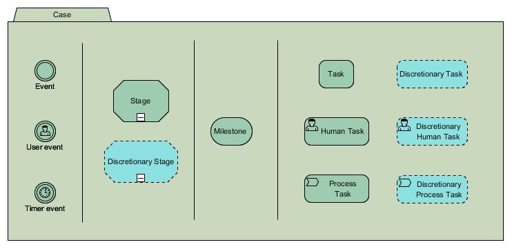
3 main model element types

A BPMN diagram consists of several model elements which can usually be divided into one of the three main types, as shown above:

  • Events - An event is something which can happen before the process (Start event), during the process (Intermediate event) or at the end of a process (End event). As you can see there are several event types; the one with the envelope symbolizes a message based event (example: you receive a message (an order perhaps?) which you need to process), the one with the clock a timed based event (for example: an event which happens every 1st of the month, like this thread! :wink: ), and so on.
  • Activities - These make up for the heart of the diagram as I like to call it. You will need to perform certain activities in order to complete your process, and these elements symbolize those activities. There are a number of different task types and you also have a so called sub-process. A sub process is basically a whole new process in itself and can be used to avoid making your diagram too complex; you basically “compressed” all that information into one single model element. Usually a sub-process refers to another BPMN diagram, but with software such as Visual Paradigm you can also easily embed it.
  • Gateways - Sometimes decisions need to be made, and when that happens we need to use a gateway. You already saw an example in my diagram above: it asked if the hole in the tire was repairable. If it was you’d proceed to repair the whole but if it wasn’t you need to take off the wheel and replace the tire itself. However, gateways come in many forms. You can make decisions based on specific situations, but you could also have situations where all or some of the outcomes are used. And sometimes the choice to use a specific activity doesn’t even have to be by choice but has to be made based on other events.

And there’s even more… There are more model elements available such as pools, lanes, data objects, call activities… And some of the activities I showed above can have variations in them. For example; it’s perfectly possible to set up a so called re-usable looping activity. But I’m not getting into all those details to prevent this post from becoming too complex. Just keep in mind that I’m basically scratching the surface here, there’s tons more which you can do with BPMN.

BPMN limitations

Houston, we have a problem… Although BPMN is a very versatile and extensive toolset which can be used to model just about everything it does have its weak spots and plain out limitations.

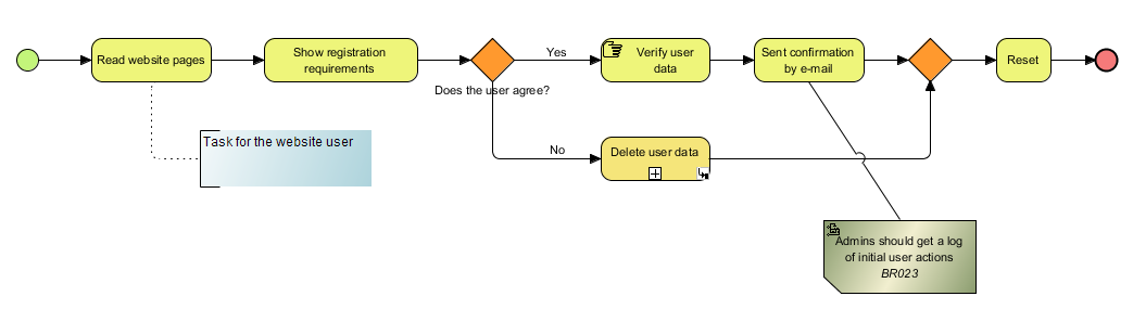
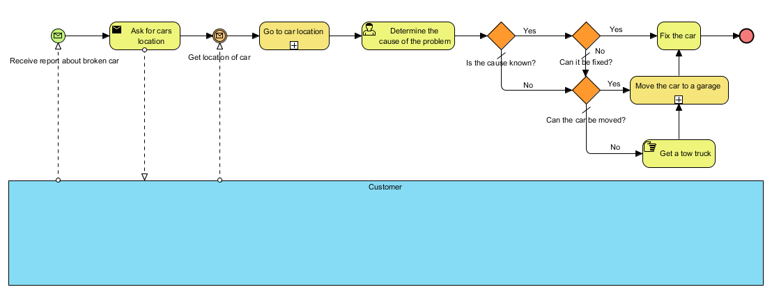
Take for example the diagram above; at the end of the flow the whole process starts to become quite messy, wouldn’t you agree? For example: what if the worker is unsure about the cause of the problem? They can’t answer yes or no in that case… I countered for this issue by setting up a default outcome (which is ‘no’, see the diagonal line) but it’s not always enough.

For example: what this diagram doesn’t take into consideration is the possibility that by trying to determine the problem we may not discover what the problem actually is, but we could have spotted enough symptoms which can help us find the cause if we’d start looking for the problem again. However, this time backed by our findings. But the diagram doesn’t let us.

Another problem is the messy ending: if the cause of the problem isn’t known or if the car cannot be fixed we move it to a garage. Unless the car cannot be moved (‘towed’) then we’ll get a tow truck. So: what if the cause isn’t known, but the symptom could be fixed? This would allow our customer to continue their way and deal with the problem at a later time.

Basically… One major weakness which BPMN has is having to deal with processes where the situation can change based on the outcome of one or more tasks. This becomes especially noticeable when you’re dealing with supportive processes such as repairing a car (shown above) or a service desk trying to fix a problem.

BPMN doesn’t really allow to set up a construction where we can say: “Leave it up to the worker (= person / company which performs the process) to determine for themselves which tasks they need to fulfill in order to finish the process”.

Please note: I’m not saying that this cannot be done with BPMN, but I am saying that if you try then you’ll most likely end up with a massively complex diagram which will be extremely hard to follow. And sometimes it honestly is impossible. As a data analyst you cannot foresee every outcome all the time in order to include it within your diagram. Yet sometimes it is important to do just that :thinking:

Fortunately the OMG (Object Management Group) acknowledged this problem as well and they gave us another modeling standard which can be used to expand (or extend) on BPMN:

Case Management Model and Notation (CMMN)

Warning: this standard can be very difficult to get your fingers behind and to use it for yourself. And if you don’t believe me then riddle me this: why is its Wikipedia page pretty much non-existing? Probably not because everyone could easily follow the ideas behind the specification I’d say :slight_smile:

In my second post in this thread I mentioned setting a too high standard for myself at first. Well, you’re now looking at it, so let’s dive right in!

Case management vs. Process modeling

When modeling a process you’re basically showing all the activities which exist between the start and the end of a process and which are also required to finish the process.

With case management however we’re approaching the whole thing in a more abstract form. The problem we’re trying to solve is now a ‘case’ and instead of having to follow one (or more) specifically predetermined (sets of) activities in sequence we now only concentrate on specific tasks which are required to close the case.

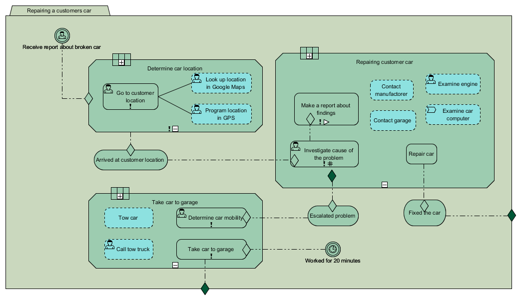
Here we have a case which showcases how we could proceed in repairing a customers car. Although there appears to be some kind of a sequence in this diagram this isn’t always the case and heavily depends on what we’re trying to showcase.

The first thing we notice is that the case has three stages:

  • Determine car location (this is required, as indicated by the exclamation mark).
  • Repairing customer car.
  • Take car to the garage.

We also see three “rounded shapes” which represent milestones within the case:

  • Arrived at customer location.
  • Fixed the car.
  • Escalated problem.

These are important parts within our case because they represent specific moments which basically affect the outcome of our entire case.

So how do we read all this?

The case of the car repair

Our case begins with a user event, shown in the top left corner: We receive a report about a broken car. This brings us to the first stage of our case: determine car location. The exclamation mark shows that this is a required stage. The stage has one human task item: go to the customer location, this task is also required. SO, in order to complete this stage we need to complete the task.

But there’s more… There are also two blue human tasks associated with our main required task. The surrounding dotted line (and the blue color) tells us that these are so called discretionary tasks. Meaning that the choice to actually perform these tasks or not fully depends on the choices or preferences by the worker.

For example: our mechanic (the worker) could already know how to reach the location of the car. They don’t need any GPS or whatever: they can get into their car, drive over and we’re done. But our junior mechanic (another worker) might not be so familiar with the surroundings. So to prepare they program the location in the GPS navigator, and maybe they also want to take extra precautions and briefly look at the environment using Google maps; this could help them to recognize the area. However: these are all optional steps, taken at the discretion of the worker. As such: discretionary tasks.

Then we reach the first milestone: we arrive at the customer location. This triggers the next stage in our case: repairing the car.

There are two required tasks: Investigate cause of the problem, and Make a report about findings. We can see that the first task leads up to the other. So: the report can only be made after the investigation.

But there are more specific issues here: the ‘Investigation task’ also shows us an hash sign (#) which means that this is a repeating task. The worker can repeat this task for as many times as they like (with a minimum of one of course). The ‘report task’ shows us that it is a user assigned task (the white arrow icon). So: the report will be made by a preassigned worker (could be the mechanic, it could be someone else).

Next we have ‘repair car’ which, if completed, will lead to the “car repaired” milestone which also automatically closes the entire case.

As before we also have several optional (‘discretionary’) tasks, but this time they also have different types:

  • Examine engine; this is a human task so it should be undertaken by our worker.
  • Examine car computer; this is a process task which means that the details about this task will be showcased using a process diagram (such as a BPMN diagram).
  • And two “contact tasks”. They’re just tasks so… the worker could do it, but anyone else could perform these tasks too.

These tasks also have no association with any of the required tasks so these could be undertaken at any given time. While examining the problem or while making the report.

Then we see that this stage has one specific outcome: an exit marker. This is basically an escalation: an exceptional exit for the task:

  • The car cannot be fixed so the problem gets escalated, which is also another milestone.

If the problem gets escalated we enter the third, and last, stage of our case: ‘Take car to garage’. As before there are two tasks to complete this stage, and both tasks are required: Determine the mobility of the car and taking the car to the garage.

Optionally we can tow the car or call a tow truck to help do this for us.

The problem isn’t necessarily solved (the car isn’t repaired) but it does close our case; the rest is up to the garage.

And finally… If we worked on this case for 20 minutes then that will trigger an event which determines that we need to stop and take the car to the garage no matter what, which will then also finish our case. This task will also result in the “determine car mobility” task because both are marked as required.

CMMN: Looks easy but it can be extremely difficult

As mentioned: everything takes place within a case, as shown above. Just like with BPMN we have a few events which can be triggered either during our case or parallel to our case.

A case can contain some stages (this is entirely optional) which can be used to group certain tasks together.

I’ve shown a few of these tasks on the right: most tasks have both a planned version and a discretionary counterpart, which so much means that these are entirely optional to undertake, this is usually at the discretion of the worker.

I didn’t show all the tasks (I don’t want this post to become too long) but definitely noteworthy is the so called process task which usually leads us right to a BPMN diagram in order to explain how the task at hand gets completed. These two standards are very much related to each other and I think their interaction is very impressive.

And finally we have the milestones. A specific and important target within our case.

The problem with all this is determining how it will work together. Due to the abstract nature there isn’t a clean cut workflow to set this up. The one thing you can be sure off is that you’ll be working within a case, but everything else becomes optional and at the discretion of the analyst.

Availability

BPMN support is provided with the Modeler edition and up.

CMMN support on the other hand is provided with the Professional edition and up.

Difficulty

BPMN

I consider BPMN to be fairly easy, however it definitely has its specific quirks and standards which you will need to keep in mind when you’re working with it. Although Visual Paradigm definitely helps you out with the resource catalog it can’t always help prevent mistakes. Therefor this gets a 3/5 difficulty rating from me.

CMMN

CMMN can be very hard to grasp because of its abstract structure which can sometimes even make things highly illogical at first glance. Also because CMMN doesn’t necessarily use a sequence such as BPMN does.

But the real challenge can come when you’re trying to use the resource catalog to add new model elements. If you added a case element and then double click on it to open the resource catalog so you can add more elements, what do you think would happen? :wink: Instead of opening the resource catalog you’d rename the case element.

This can be easily fixed by making the case element non-selectable yet then you’ll face another difficulty: adding new model elements is very easy, just double click and select them from the resource catalog. But connecting model elements can get tricky, especially if you forgot to add a critereon (for which you can’t use the resource catalog).

And then I haven’t even mentioned adding controls to your model elements (for example: to indicate looping or making it required) :exploding_head:

It is honestly easy once you know how it is done, but it can get tricky before that.

Therefor CMMN gets a 5/5 difficulty rating from me.

However: please don’t let this discourage you. Because if you start using it you’ll soon realize just how immensely flexible this is. The main problem is that you need to become more familiar with the specification, and that will take time.

And there you have it!

The diagrams for August 2018: BPMN and CMMN.

1 Like

October 2018

Hi gang!

It’s time for the next diagram of the month!

Editorial

Sorry for the small hiatus but I had to skip September because I was enjoying a well deserved vacation. But I’m back and we’ll see where things go from here. One thing I can tell you is that Visual Paradigm never stops to amaze; I’ve been gone for a few weeks and can already notice several enhancements :slight_smile:

Enhanced PERT chart

PERT, short for Project (or program) Evaluation and Review Technique, is a diagram style which was originally designed by the US Navy and it’s used within project management. A PERT chart usually shows you the different tasks of a project and the time it’s expected for them to take.

image

When it comes to project management then people are probably more familiar with the Gantt chart (a chart named after Henry Gantt and prominently used in software such as Microsoft Project) instead of PERT. I still remember that I also had to adjust my expected workflow a bit.

But trust me when I say that PERT can also deliver. So what’s the difference, other than the obvious different appearance?

PERT vs. Gannt (briefly)

As you can see above a PERT chart focuses on the individual tasks of a project, the time it will take them and the relationship between them. While it makes it very obvious that a certain task relies on another it becomes a little more difficult to get a good overview of the time that is involved.

Which is where a Gantt chart becomes more feasible: it can show you the different tasks, the (estimated) time it will take to complete them as well as the current progress. Although the current status of a project will become quite obvious it will become more difficult to get a good overview of the relationship between the tasks.

This is why, generally speaking, a PERT chart is at its best while planning and brainstorming an upcoming project whereas a Gantt chart is most usable when you’re actually working on such a project.

Fun fact: Visual Paradigm supports both charts. PERT is provided by Visual Paradigm itself wheres you can manage Gantt charts using VP Online’s Tasifier.

Enhancements

Within Visual Paradigm the chart type is called an Enhanced PERT chart and for good reasons; VP provides us with several options which seriously enhance the overall functionality of the PERT chart.

Color legend

The default set up, as shown above, is simple: we have a few tasks, we show their dependencies using arrows and we’re pretty much done. But by utilizing the color legend we can add a whole new dimension to our work:

Now we don’t only have a collection of tasks, we also get to see more information about them. In this case the approved status of a task.

PERT to Tasifier

Your chart does need to comply to a few requirements, such as the use of a task pool (which mine doesn’t) but if you meet those then you can easily copy your tasks into Tasifier (which in its turn will also give you access to a Gantt chart).

And the other VP specific features

As you probably know VP provides many specific features to enhance our information processing needs. You can display the model element properties and provide meta data. Or expand on a task, for example: how would one consult Wikipedia? This may seem like a silly question at first, but within an Enterprise environment it’s often not too common that employee’s can freely access the Internet.

As such you might want to create one (or more) sub diagrams which can investigate and reflect on that problem.

Availability

The Enhanced PERT chart is available in the Professional edition (and up).

Difficulty

I’m giving this a 2 out of 5. The diagram fully supports the resource catalog (double click on the canvas somewhere to display it) which makes it very easy to set one up. However, as with most of Visual Paradigm’s diagrams you can basically make this as easy or as difficult as you want.

And there you have it… The diagram of the Month for October: Enhanced PERT chart.

1 Like